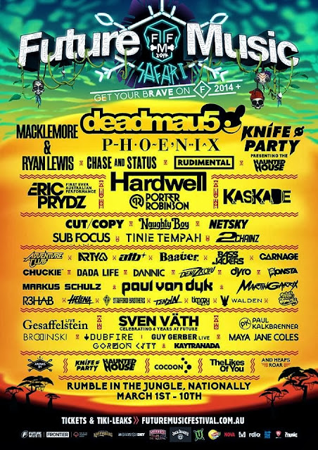
I like this flyer. The style and color scheme actually work with the name of the festival and the font choice. The graphic at the top of the flyer is eye catching and interesting, and the rave-like color scheme with the white background give the flyer fun and energy. I dont know who created the flyer, and I picked it because we are making a festvsl flyer in class.
Friday, February 21, 2014
Thursday, February 20, 2014
Interesting Festival flyer
This is an interesting design for a flyer. The design work and typography in the titling is very well done, as well as the fonts and spacing in the band listing. I like they way they incorporated the bands logo and font to an extent, but it still flows with the design. The only thing I don't understand is the music festival is called future music Safari, but the design is made with voodoo and voodoo heads. I dont get that part, but the design and spacing and color scheme are all fantastic. The promoter for the festival is Future Entertainment, but I dont know who specifically designed the flyer. Well done!
Sunday, February 16, 2014
Electronic Festival Flyer
This flyer his a very interested ing design. I definitely get the feel of an electronic festival when I see it, but I am not a fan of the split down the center design. Its very symmetrical and neat, and an electonic music festival is fun and kind of crazy. So I think the color scheme is good and the background picture and fonts are good. But, the acually design is lacking in creativity and feel. Obviously, I picked this flyer as a blog post because we are making a flyer for an electronic music festival. I could not find any information on the designer of the flyer.
Tuesday, February 11, 2014
I can certainly do better than this...
I decided to critique and old Kinetik Festival flyer because that is the festival we are doing for project 1. For starters, I really do not like this flyer at all. The spacing is confusing and disproportionate. the shapes used are visually awful. Also, the robot machines on the sides have nothing to do with electronic music do they? Plus, I have no idea of a time or venue, and my final complaint is I do not know who the headliners are. Oh, and does the viewer really need to know the country each artist is from? It seems like a lot of wasted space where other, more important information should go. Overall, a very ugly, uninformative flyer. I certainly don't want to go to the Kinetik Festival now.
Monday, February 10, 2014
Good, simple festival flyer
So, I was simply google searching recent music festival flyers. I came across a flyer for the Folk N' Acoustic festival from December 10th. There is not a yearly date so I'm not quite sure what year the festival is from. I picked this flyer because it contains the same restrictions we have for project 1; simple color scheme, text only. The design is so simply, yet so powerful. The emphasis is on the name of the festival with the powerful sans-serif fonts that work very well together. Plus, the black and red color scheme, mixed with the vintage texture is very appealing to the eye. Finally, the spacing throughout the flyer is virtually perfect. My only critique is there are 5 of 6 different fonts used. Although they are used well, it is right on the edge of good and over the top.


