Friday, May 2, 2014

Ghirardelli Digital Menu


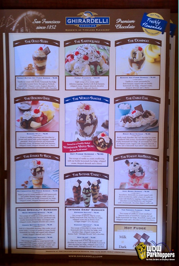
This menu is okay. Nothing special. Its very well organized, and set up really well for a nine item menu. It gives off the mood of elegance, but also of fun and childishness. The photos are very professional, but i don't like how the item description is is so long and centered so poorly. There is a lot of awkward negative space in the white box. Pretty good though.

Biergarten Beer Menu


This is a great idea for a beer place.  but its not done well at all. It is sooooo off center. The should have made the beer mug more central. There is just so much negative space on the right and no space on the left. Also, there is no organization in the menu items. It is all the same size and color and it all kind of blends together. Also, the top of the beer mug should be circular in my opinion. Just saying. Not very good menu here.

Olivia's Menu

This is a pretty good design but it could use some help. I like the layout of the menu items. The bold title really separates from the description making it very readable. Also, the color scheme and the diagonal title really make it feel old timey. However, why is it cut out around the text. It gives the text no room to break whatsoever, not to mention its just super cheesy in of it self. Just make the edges straight and it would totally fix that problem. Pretty good never the less. Just some basic design rules broken here.

Wolfgang Puck Menu


This menu really isn't bad. First glance you think its really out dated and 90's looking. But Its actually trying to involve the African style, and i think it does that fairly well. The crazy amount of movement and jagged edges around the border may be a little too much but its cool that the border makes a maze. Also the typography is pretty clean. Some good contrast between the red and type and the bold and regular brown type. Its not too confusing, yet its says in the same font family. Good job.

Coral Reef's Alcohol Menu


This isn't terrible but it could definitely use some help. The first thing i notice is the hierarchy is off. The menu items are bolder and stick out more then the menu groups, and the prices and some of the descriptions get lost in the weird zebra-like pattern in the background. The pattern works, but the opacity of the blue needs to go down a bit more. I like that the menu groupings have a coral back drop to tie in with the name, but it is virtually the same color as the text on top of it. If the coral was darkened a little and the text was lighter or white i think it would fix the hierarchy and the readability of the piece.

Tusker House Menu


This is an interesting menu. It only has 6 menu items, the rest is just descriptions, so its somewhat unique. Im not a huge fan of the font choice, however, i think it works for the style of the restaurant. I also love the border around the menu. Its very different but it definitely aids the menu's aesthetic. Well done overall.

Sci-Fi Dine In Menu


This isn't too bad. Again, the hierarchy is off though. The most important thing, in my opinion, should be the menu groupings, and here is see the menu items with the most eye popping contrast. The rest is pretty good. I actually like the cheesy stars and UFOs all over the page. I think it aids in the childish style they are going for. The organization is good, the design is good, but the hierarchy could be tweaked a little.

Portobello's Children's Menu


Be Our Guest Menu


Main Street Pub Menu


Olive Branch Menu


Filene's Menu


Alcohol Menu


Crystal Tea Room Menu


Fuji Water Bottle Label


Evian Water Bottle Label


Smart Water Bottle Label


Spring Water Bottle Label


Poland Spring Water Bottle Label


Philbest Water Bottle Label

What scares me is the fact that this is actually a real water bottle label. It is so cheesy and the typography is awful. The spacing in the small type is terrible, and all over theplace, i cant stand the font of the main title and the condensation photo in the back has been done 100 other times.  Poop.  

Transitions Water Bottle Label


Aquasia Water Bottle Label


Refresh Water Bottle Label

http://s296.photobucket.com/user/fonzo2005/media/WaterBottleLabel.jpg.html

Arrowhead Water Bottle Label

This water bottle label is interesting. I like the front face, but i think the green recycling area throws off the entire design. Also the spacing in the info paragraph is centered and looks terrible. I leaves a mess of negative space on the sides of each line. Also the barcode is way too big in my opinion. There than the front, Its pretty bad.

Monday, March 24, 2014

2009 Dasani Water Label


this is an old water bottle label design 4 Dasani in 2009. To be honest I hate it. the radial gradient in the background is very childish and it looks like a highschool graphic students did it.  Then to make matters worse the entire small print has a blue stroke on it. Terrible. The only good thing is the dasani logo. And that is just an elongated S and an extended cross in the A's.  Its extremely basic, which is good, but there is nothing to draw my attention and the fundementals are completely absent.

Monday, March 3, 2014

Collage For Font


I love this design! Its so creative and unique. It looks like Iit is just a photo of so arranged greens and sticks that spell out the name of the book. Its genius. The typography alone gives a very rural, woodsy, DIY kind of feel.  I have no idea what the book is about, but that is the mood i immediately feel i also like the warn out, faded paper as the background. It adds to the recycled DIY feel. Very good book  cover!

Reverse Font For Book Cover

I love this  design. the sans-serif font is simple and sleek, but having the background show through the font is genius. I assum the cover is like a sleeve so you can take it off and see the artwork. It is such a simple idea, but it is so eye catching and attractive. I chose this cover because it is text only, which is out objective for project 2.

Paper illustration Cover

This is a great cover.  I know it uses mainly illustration, which goes against out specs for project 2 , but I just thought it was so unique and fun. It looks like it is a picture of a small scene made out of paper. Then, the title is so well made. The different changing fonts and colors in  the title works perfectly with the childlike fun animation. I also like the way the authors name is inbetween the words in the title. Ive never seen that before, but it looks great! Lastly, I like the way the waves spill out of the border. its so well organized and created. Maybe my favorite so far.

Minimal Design

This cover design is so minimal but its so effective. Ive never read the story, but i assume it has to do with an eye based on the oval shaped contrast and the eye hidden in the middle of the 8. I like that the eye references are very subtle and not just a huge eyeball in the middle of the page. It really makes yoy think about it. Well done peice.the one negative I have is maybe the font choice. maybe something a little smaller and Bolder. 

Font Choice

This is a unique book cover. I like how the font seems hand written butit still had that formal serif feeling. Its very different, but its good. I also like that the type is bound by the hand drawn jug design. However, i am not a fan of the green and redish christmad colors. But, overall, the cover is very fun and unique.

Eye Moving Book Cover

I am not the biggest fan of this one. 
the potential is there but there's way too much movement in the background, which takes away from the rest of the design. I think it is suppose to be like an octapus, but it's just not working. And the font... ugh. The hand written serif font mixed with a white stroke is just awful. this goes along with project 2.

Great Use Of Negative Space


This design is very mysterious. The black and white contast of the two hands makes me feel very uneasy and curious, which is great! Plus the smeared hand-written font aids in the creapy feeling. I picture the book being about a father and his child based on the illustration. Its very simple but extremely effective. Great cover.

Infinite Sky Cover


I love the font here. The way the barbed wire spells the title is great. That, mixed with the tall grass and the insects gives a forbidden, adventurous feel which I imagine the book is about. I also like how the autors name is smaller and away from the illustration.  It allows all the viewers focus to be one the title. I do not like the color choice however. The aqua green really gives an ocean water feel,  which goes against the ski idea. It may also be that i just dont like the color. But overall, its a very unique way to create text and i think the piece works well.

Strange Font for Book Cover


I am not a big fan of this one. When I ffirst look at it, all I see is the vision test you take at the doctor's. The font is cool but I don't understand why they used 5 lines to write it out. Its way too much. The spacing is good though, and I like the font choice and font spacing in the authors name. But the overall design is weird and really poorly planned.

Art Deco Book Covers


This example is several covers.  But they all have the same idea; using a wallpaper-like, repeating pattern as a book cover.  I love the idea and think all of these work well for theiparticular title. They are all beautiful designs and give off a warm homey feeling which really draws you in. Great idea for a cover.

Bleh Book Cover

This designis pretty weak. For starters I cant stand the font. I understand why the designer would chose it because it kind of looks like elephant tusks, but it is just so ugly. Its right up there with comic sans. I also do not like the Organization of the cover. The way the title overlaps the white oval is terrible and throws off my eyes. Also why is the authors name right-aligned when the title is center-aligned and the summary on the back is left-aligned... terrible. and they just used a smaller version of the covet illustration for the back. Nothing good to say. Pretty much all bad.


contradicting Book Cover

I have mixed feeling about this one. Im not sure whether i like it or not. The design and organization of the design is okay, and it is aesthetically pleasing, but I don't think I like it. I don't like the way it is centered on the back cover, and the font is so 70's but the illustration and color of the background feel classic and 1920's. Its just the awkward font choice and font design. It throws off the vintage feel of the rest of the cover. It's on the right track, and maybe the font has something to do with the story but i am not a fan.

Different Font Book Cover

I like this design. It's not the best, but its not bad. The font choice is very rookie and cliche, but it has the right idea. A little bit of tweaking their and it would be good. I don't like the pink box behind the Flip-flop illustration. It ruins the flow of the striped background. I do however like the organization of the wording, although it could use a little leading changes, but its good. And, I like the flip-flop illustration. Its witty and "cute" and fits the cheesy cover design.

Contrast Book Cover

I love the simplicity of this cover. Just the way the word dead is flipped in opposite contrast to give the feeling of it being buried. I also love how "you" and "me" are the biggest so the viewer is really drawn to those two words. I also like how the bunny is just dropped into the cover. It gives the cover a little more then just text. Well done!

Weak Typography Book Cover


I'm not the biggest fan of this cover. First off, in the title, the balance is awful. The title looks like it should flip over, I hate the underline under clockwork, and the A is so out of place. plus the text is way too close to the right side of the page. The overall typography on this cover is just awful. The only positive thing here is the contrast between the blue eye and the orange background. It really draws your eyes to the eye color, which is good because it keeps you attention off of the terrible title.

Music Festival Flyer


This design is fantastic. I love the background gradient of the neon colors mixed with the laser like stroke on the words. I love the negative space city scape. It really adds to the piece. I don't like the broadway-like font that is used. It goes against the rest of the piece, and ruins the 3D feel of the flyer. Aside from that, i love the color scheme and the big 3D type. Very well done.

Sasquatch Music Flyer


I really like this flyer. It reminds me of fosters home for imaginary friends. It's very chaotic and has a lot of movement. Plus, the animation at the top of the flyer really draws in your attention and makes you read the rest of the flyer. Normally having multiple different fonts would throw off a piece, but because of the messy style of the flyer i think it really works here. There really isn't anything negative i could say about this piece. The color scheme, font choice, animations, and text all work great together.

Alternative Music Festival Flyer


I love the sepia tone color scheme in this one. The multiple shades of orange and the light red work perfectly together. I love the burned, discolored edging, and the diagonal movement in all the text.  I'm not the biggest fan of the wavey circle in the background. The rest of the design is very sharp and geometric, and the circles just throw it off. I also think there are way too many fonts used. With this clean, straight idea, there should only be 2 or 3 fonts maximum. Overall its very well done and looks good as a whole.

Music Festival Flyer

I really like this design, even though its not the most aesthetically pleasing. I love the box design. Its very unusual to see that on a poster. The only issue is the color choice makes it hard to read and focus on, and the multiple font choices makes it even harder to read. There are 5 different style fonts and 6 or 7 different colors, which isn't always bad, but these colors clash really bad. Its a shame really, because the organization and logo and illustrations are all really well done and really creative, but a few little mistakes ruin the design.

Saturday, March 1, 2014

Typographic book cover

This book cover is phenomenal.  The typography and font used pefectly describes the word it is made from. It is so simple, yet it is perfect. Fact is described by the serifs and the formal nature of the font, fiction is handwritten which gives off a made up mood, and form is drawn and scetched like a well thought design with left over angle lines and edits. Then the handwritten essays faded as the background completes the peice. It is simply genius. The book was edited by James and David Richter, but I could not find the designer of the cover. This book cover ties into project 2.

Friday, February 21, 2014

Magnetic music festival

I like this flyer. The style and color scheme actually work with the name of the festival and the font choice. The graphic at the top of the flyer is eye catching and interesting, and the rave-like color scheme with the white background give the flyer fun and energy. I dont know who created the flyer, and I picked it because we are making a festvsl flyer in class.

Thursday, February 20, 2014

Interesting Festival flyer

This is an  interesting design for a flyer. The design work and typography in the titling is very well done, as well as the fonts and spacing in the band listing. I like they way they incorporated the bands logo and font to an extent, but it still flows with the design. The only thing I don't understand is the music festival is called future music Safari, but the design is made with voodoo and voodoo heads. I dont get that part, but the design and spacing and color scheme are all fantastic. The promoter for the festival is Future Entertainment, but I dont know who specifically designed the flyer. Well done!

Sunday, February 16, 2014

Electronic Festival Flyer

This flyer his a very interested ing design. I definitely get the feel of an electronic festival when I see it, but I am not a fan of the split down the center design. Its very symmetrical and neat, and an electonic music festival is fun and kind of crazy. So I think the color scheme is good and the background picture and fonts are good.  But, the acually design is lacking in creativity and feel. Obviously, I picked this flyer as a blog post because we are making a flyer for an electronic music festival. I could not find any information on the designer of the flyer.

Tuesday, February 11, 2014

I can certainly do better than this...


I decided to critique and old Kinetik Festival flyer because that is the festival we are doing for project 1. For starters, I really do not like this flyer at all. The spacing is confusing and disproportionate. the shapes used are visually awful. Also, the robot machines on the sides have nothing to do with electronic music do they? Plus, I have no idea of a time or venue, and my final complaint is I do not know who the headliners are. Oh, and does the viewer really need to know the country each artist is from? It seems like a lot of wasted space where other, more important information should go. Overall, a very ugly, uninformative flyer. I certainly don't want to go to the Kinetik Festival now.

Monday, February 10, 2014

Good, simple festival flyer


So, I was simply google searching recent music festival flyers. I came across a flyer for the Folk N' Acoustic festival from December 10th. There is not a yearly date so I'm not quite sure what year the festival is from. I picked this flyer because it contains the same restrictions we have for project 1; simple color scheme, text only. The design is so simply, yet so powerful. The emphasis is on the name of the festival with the powerful sans-serif fonts that work very well together. Plus, the black and red color scheme, mixed with the vintage texture is very appealing to the eye. Finally, the spacing throughout the flyer is virtually perfect. My only critique is there are 5 of 6 different fonts used. Although they are used well, it is right on the edge of good and over the top.